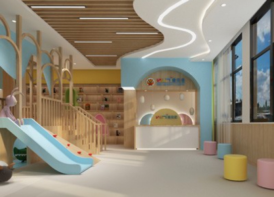
维贝尼国际儿童教育中心正商华钻店是我们与维贝尼合作的第三家分店,作为连锁早教中心,甲方一直在寻找除去LOGO以外分店装饰设计的共性,来加深维贝尼品牌的形象宣传。正商华钻分校空间有限,甚至有些局促,所以如何在满足功能规划的前提下,充分利用空间增加幼儿活动区域、形象展示区域是本案的设计重点。
As a chain of early education centers, Party A has been looking for common features in decoration design of branches other than LOGO to deepen the image promotion of Vibeni brand. ZhengShang Huadian Campus has limited space, even some constraints, so how to make full use of space to increase children's activity area and image display area under the premise of meeting the functional planning is the design focus of this case.
拱形有着保护的精神色彩,最终宏钰堂早教装修设计团队选用连续拱形的元素来作为空间记忆点。提取LOGO中的湖蓝色、明黄色作为空间主色系,在原木色的搭配中,整个早教中心呈现出优美的序列感。仪式感的设计延续到教室走廊之中,单面墙壁以字母墙和Family time装饰,充满亲切感。教室设计简约明亮,大面积的色块变化让整个空间活泼又生动。
Arch has a protective spiritual color, and ultimately Hongyutang designers choose continuous arch elements as spatial memory points. Extract the lake blue and bright yellow in LOGO as the main color system of space. In the matching of log color, the whole early education center presents a beautiful sense of sequence. The ritual design continues into the classroom corridor. The one-sided walls are decorated with alphabetic walls and Family time, full of cordiality. Classroom design is simple and bright, large area of color block changes make the whole space lively and lively.
完工实景图对比


